My SF MoMa Experience
BLOG POST — SF MoMA
(Blog Post + Bay Area Exhibition Review)
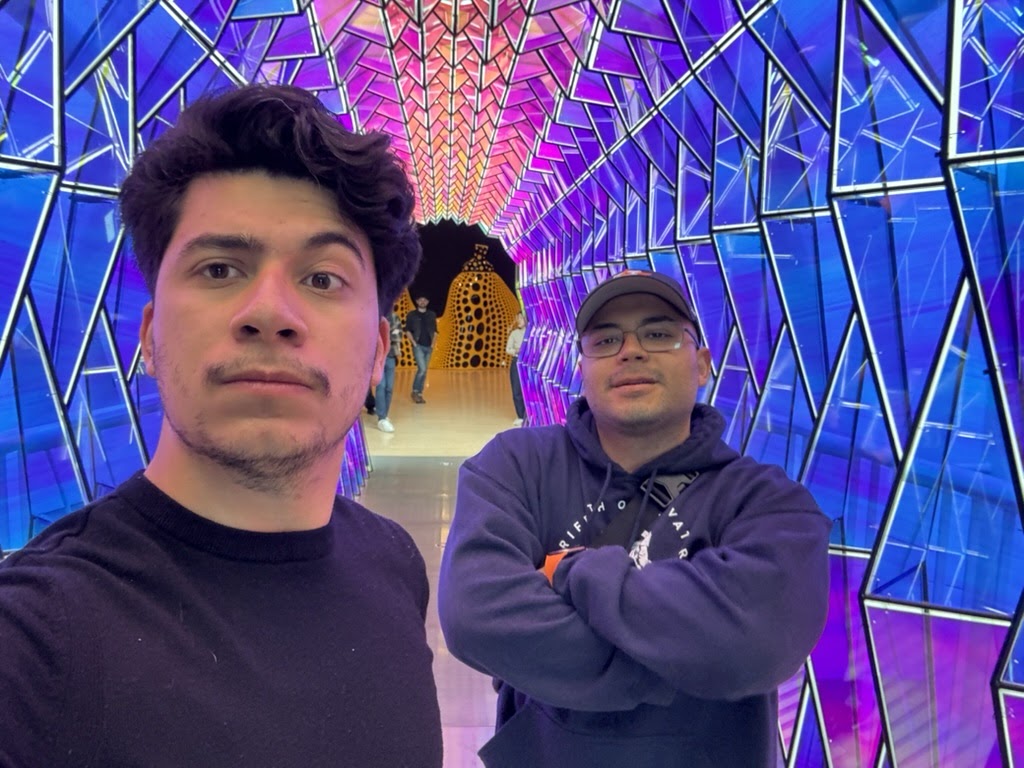 |
| My friend and I on the 5th floor |
My recent visit to the San Francisco Museum of Modern Art (SF MoMA) was an eye-opening experience. It isn’t the first time I’ve visited the museum, but every time I visit is always a new experience. What I love about this museum is the diversity of artwork showcased—from paintings to sculptures, photography to architecture, and filmmaking to next-level immersive experiences. Many exhibitions caught my eye and resonated with my artistic tastes, but one specific 1970s exhibition caught my attention.
Brice Marden and his 1970 Exhibition Review
One of the art exhibitions after 1970 that I appreciate is Brice Marden's work. Marden was an artist born in 1938 in Bronxville, New York, whos work roots in minimalism, abstract expressionism, and color field paintings. Marden is renowned for his contributions to minimalism through his exploration of color and form, which was groundbreaking at the time.
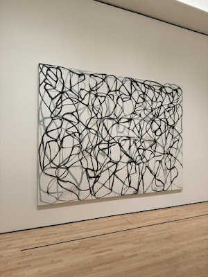 |
| Brice Marden, Cold Mountain 6 (Bridge), 1989-91, Oil on Linen |
Movement & Stillness
The exhibition, aptly described as "a kind of dance," on the front wall, offers a captivating look into Marden's artistic process and evolution post-1970, marked by his departure from monochromatic canvases to the incorporation of vibrant colors and intricate linework. His paintings, characterized by their fluid, gestural lines, and layered surfaces, invite viewers into a meditative space where movement and stillness unite. The paintings, some sprawling across vast canvases, pulsed with life, their lines twirling, bending, and stretching across the surface. Marden had distilled the essence of motion and rhythm into each stroke.
The Curators Made this Exhibition Pop
What set this exhibition apart from the works' visual impact was the curators' insightful analysis. Through careful curation and thoughtful commentary, visitors were guided through the evolution of Marden's artistic journey, highlighting his shift from minimalism to a more expressive form of painting influenced by his travels, particularly to Greece and Asia. This context enriched the viewing experience, offering a deeper understanding of the artist's intent and the cultural influences that shaped his work.
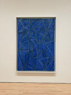 |
| Brice Marden, 6 (course), 1987-88, Oil on Linen |
My Experience at MoMA
I am grateful for the opportunities I have in my classes to go out and explore museums and be exposed to the fantastic world of artwork. One thing is to study something and only see it through a PowerPoint presentation, but another is to see the artwork with your own eyes. Roy Lichtenstein, Andy Warhol, and Frida Kahlo, among many other artists, are all artists I have studied whose work I saw in this museum.
Though these incredible exhibitions fascinate me, what equally captures my interest is the architecture, signage, graphic design, and even the people from around the world I encounter.
The museum is centrally located right in the urban core of San Francisco, its immediate surroundings providing a relaxing and inviting atmosphere, despite being in the city center. Right across the block is a park, The Contemporary Jewish Museum, and the Yerba Buena Center of the Arts. If you are a city lover, you will most definitely enjoy visiting.
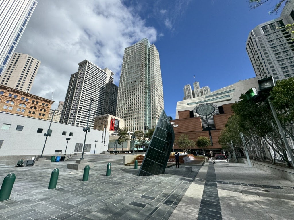 |
| The museum in the urban core of San Francisco |
The Graphic Design
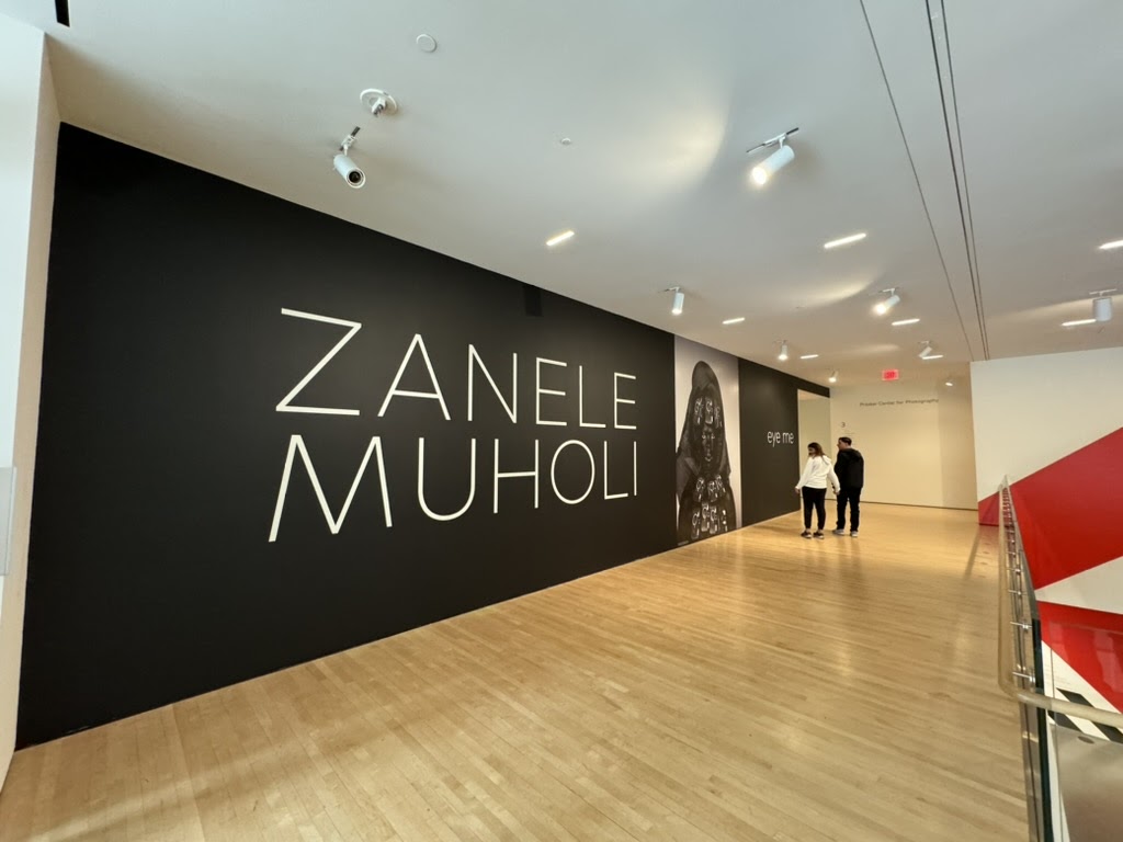 |
| Zanele Muholi: Eye Me (Second Floor) |
 |
| The MoMA café on the fifth floor |

You got a lot out of your visit to SFMoMA, Kevin. I'm impressed by the way you represented it as a whole cultural experience consisting of the various exhibitions, exceptional curatorial and architectural statements, and the building's center city location.
ReplyDelete